Here is the basic home screen for the Boxee Box (taken via phone camera, so forgive any flaws):

On first brush I don't really have any problem with the design of the home screen. It fits a lot of options into a small space and emphasizes what seem to be important things, but let's take it apart a bit and you'll see why much of what the Boxee Box has to offer is useless to me.
First I want to mention the three big boxes at the bottom of the screen. These are "featured content" and they are determined solely by the Boxee team. There is no way to get rid of them. There is no way to change them. They update somewhat infrequently and show only content which the Boxee team thinks belongs in the space. So, that area is completely out of my control. Sometimes the videos linked there are not bad or even really good. In some sense I am indifferent to the fact that the Boxee team wants to reserve 50% of the home screen real estate for themselves. As you'll see in a second, there isn't really a compelling reason to ever return to the home screen after the boot up. The only thing that bothers me about this "feature" stems from the fact that I desire the ability to make my own easily accessible shortcuts, which the Boxee Box does not provide. Hence, these videos slots on my home screen seem to me to be better able to be used as my own shortcuts (but that's a moot point because the option is not and will not be offered - selling content for their partners is the only way the Boxee team sees any profit).
Second, I should address the row of icons across the home screen.
Friends & Watch Later:
This video I uploaded shows the Friends Feed and the Watch Later icons in action.
The Friends feed is pretty nice. It automatically aggregates video links shared by your friends on any service you choose to associate with your Boxee Box. We chose to associate Esther's facebook profile with the Boxee Box and so any of her friends on Facebook who share a video automatically populate this section for us to view at our convenience. It's a slick feature and I really like it.
The Watch Later option is very nice as well. While you can tag videos to watch later while you are browsing the Boxee Box itself, the real power of this feature is the ability to add a bookmark to your browser which activates a Java applet that can automatically save any video you come across while browsing the internet to the Watch Later list and enable you to access it easily when you are at home using your Boxee Box. I think it is a really smart feature and Esther and I have gotten quite a lot of use out of it.
Shows & Movies:
These two central icons should, in my opinion be our most used destinations on the Boxee Box. Sadly they are not, and this has a lot to do with how the Boxee software works. My biggest problem is that the Boxee software (which is based on the XBMC software, so that media center shares the same trouble) only knows how to read file named a certain way. It's not a bad way, it just isn't the way I name my files. I suppose I could rename all of my files, but that doesn't interest me. Really, there is a very simple solution to the problem. Boxee and XBMC should support meta tags, which all of my video files have. However, they do not and they have no plans to incorporate this into their software. Hence, it ends up looking like this:

1) It errors out on about 50% of the files and refuses to bring in the correct details even though they've been manually identified.
2) When the Boxee Box loses its connection to the source folder (which happens frequently because the Boxee Box has a lot of trouble maintaining stable connections to Windows 7 64-bit shares) it "forgets" all of the files you've manually identified, meaning you would have to start over, which just isn't worth it.
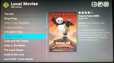
The Movies section is a little better:

The whole thing is especially frustrating because I have all of the necessary information stored locally in a meta tag embedded into each file. So, there's no need for Boxee to do the heavy lifting of finding all of the information online. However, again, the Boxee software simply doesn't support these meta tags, so I get a retarded, half-functional interface instead. What could have been a nice bonus feature is instead a tremendous headache.
I've gotten around this, though, by using the Files icon almost exclusively.

This brings me directly to my shared folders so I can browse the files (which are named clearly and are easy to navigate and understand. This brings me back to the need I mentioned previously. I would like to have some ability to make easily accessible shortcuts so that I could get right to these shared folders without navigating through the Files page. It's not a big deal, but it would be nice. It is supported on the PC version of the Boxee software (there is a row of user-defined shortcuts on the popup menu, which I will get to in a second), so it doesn't make a whole lot of sense that the feature isn't available on the Boxee Box.
Inside the shared folders via the Files option on the Boxee Box, it's a simple matter of navigating as you would through the folder structure in a normal Windows environment. Clean. Simple. Easy to understand.

Now, on to the menu. The menu button does not bring you back to the Home screen as you might expect. In fact, if you want to get back to the home screen, you have to specifically select it as a location. This is actually a very good thing (though less than intuitive) because there is no real inherent value to the home screen once you familiarize yourself with the popup menu. Hit the menu button and you'll see this:

It's a little overlay that gives you easy almost instant access to any area of the Boxee Box. As we don't use the other areas much, I don't use this menu much, but it is convenient nonetheless. It also gives you your access to the shutdown controls which, of course, I use at the end of every session with the Boxee Box. Interesting to note: the Boxee Box is "designed" to go into a standby mode to provide an "instant on" instead of booting up every time you want to use it. However, in my experience, the Box becomes sluggish and buggy if you choose to use this feature, so I just turn it off every time since I don't mind waiting a minute for it to come back on when I need it.
Oh, and lest I forget, there's the apps screen. This is another feature that's fairly well done by the Boxee team. While there are literally hundreds of - if not more than a thousand - apps available to the Boxee Box, but you can set the apps screen to show you only the ones you've tagged as favorites. Typically, Esther and I only use the Netflix app, but I populated the screen with a few to give you an idea of what it's all about:

And to further your understanding, I made a video of launching the Netflix app and browsing through it for a second or two:
Personally, I think the interface and the interaction is fairly smooth, although Boxee leaves the construction of the apps and its controls entirely to the app developer. This does mean that the Netflix app is not entirely intuitive to use (things like the play/pause button do nothing inside the app) but it took us all of three seconds to get over this.
Oh and one last video to close out. Here's what it looks like to launch a YouTube video on the Boxee Box. Some people feel the interface is very jarring and not professional or smooth at all. I personally don't mind it, but it's not necessarily perfect. At least it has all the correct function to it: it takes you to the video and makes the video full screen without any further input.
So, there it is, the Boxee Box interface. To summarize, I think it is a very nice interface, but if the Boxee Box were able to connect to my shares better and read my meta tags it would be perfect. As it stands right now, about 50% of it is useless to me.
No comments:
Post a Comment